Feature 269 block design & features
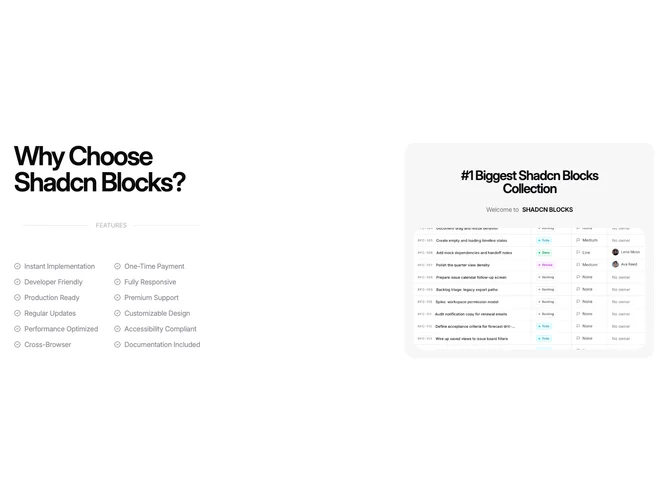
Feature269 is a split marketing block that aligns with Shadcn UI typography and spacing conventions while the motion-reactive 3D card comes from Aceternity: a text stack on one side lists benefits and the tall card shows the visual story on the other. The copy side leads with a large question-style heading, a slim label row with hairline rules and a small FEATURES tag, then a two-column grid of short lines each prefixed by a badge-check glyph. The card side repeats headline and welcome lines, then shows a full-width rounded photograph that lifts slightly on hover inside the muted rounded panel.
Muted neutrals dominate the list area so the icons and lines stay sharp without heavy chrome. The card uses the same soft gray shell as similar blocks in the collection, emphasizing photography and bold interior headings. Typography on the heading is tight and display-sized; list items stay smaller and evenly spaced in a compact grid.
The layout feels like a capabilities panel beside a product teaser: dense checklist on the left, single visual story on the right. It is moderately complex because of the checklist density and the 3D card behavior. You need up to twelve concise labels plus one flagship image and card copy that matches the page narrative.
On narrow viewports the columns stack with the heading and grid first and the card following, keeping the checklist in two columns where space allows.