Feature 14 block design & features
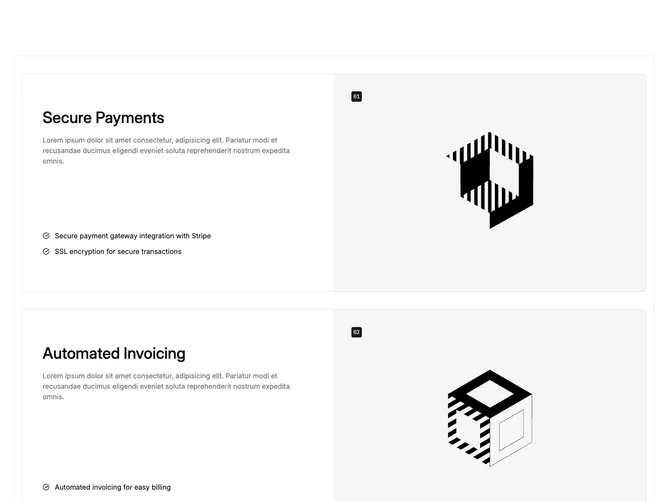
Feature14 is a double feature comparison built with Shadcn UI utility styling. An outer rounded border wraps two inner grids stacked vertically with space between them. Each inner grid becomes two columns on medium screens: one column holds a large heading, muted introductory copy, and a checklist using small circle check icons beside each line; the other column is a full-height photograph with a compact numeric badge anchored near the top corner of the frame.
The visuals lean institutional: nested borders, generous padding that grows at wide breakpoints, and imagery that covers its cell edge to edge. Headlines read large while body copy stays smaller and muted. The numbered chips use a solid primary fill with monospace figures so the two rows read like ordered case studies without a timeline spine.
Overall the block feels structured and trustworthy, closer to a formal service explanation than playful marketing. It is moderately complex because you need two complete stories (copy plus bullet lists plus art direction) for the repetition to feel intentional rather than hollow.
On mobile the image panel can appear ahead of the text column, with the checklist following so bullets stay easy to scan.