

Feature 134 block design & features
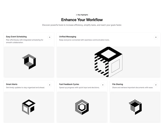
Feature134 opens with a narrow, centered intro column: outline badge with a small flame icon, a large semibold heading, and a muted supporting paragraph. Below that sits a responsive grid of link tiles built with shadcn/ui styling. Each tile is a vertical stack with a padded header row, title and description on one side, and a circular bordered control with a directional arrow on the other, then a full-width image band capped with rounded corners.
The mosaic alternates density: one tile spans two columns on large screens while neighbors stay single column, so the section reads as a structured bento rather than five identical cards. Borders and restrained typography keep the focus on headlines and photography. Hover and motion are minimal; the affordance is the arrow-in-circle pattern and the whole card behaving as a link.
This is a moderately elaborate marketing feature grid: more layout variation than a uniform three-up, but still content-driven because each tile needs a headline, blurb, and image. The badge-and-flame cue is a small brandable accent at the top.
On small screens tiles stack in source order with images still beneath their text blocks, so scanning stays top-to-bottom inside each card.