Feature 122 block design & features
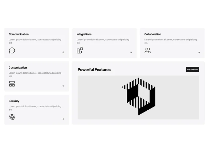
Feature122 is a bento grid built with Shadcn UI buttons and Lucide icons for category labels. Five smaller tiles show titles, muted blurbs, and medium-large stroke icons anchored at the bottom with an arrow affordance. A doubled-width and doubled-height accent tile sits offset in the grid, pairing a bold heading with a full-width primary button and a large rounded rectangular graphic that spans most of the panel for a focal visual. Tiles use soft accent backgrounds that deepen slightly on hover, while titles pick up an animated bottom border when hovered.
Iconography is consistent line weight across categories like communication, integrations, and security, which keeps the cluster cohesive despite varied meanings. Typography keeps small tiles compact, then jumps to bold display sizing inside the central callout, reinforcing hierarchy between satellite points and the primary story.
The layout is elaborate in choreography but still a marketing pattern at heart: many small claims surrounding one big ask. Content teams should align the five bullets with the narrative promised in the central panel graphic and CTA for a single storyline.
The grid reflows for narrow screens, allowing the highlight panel to anchor mid-scroll once sibling tiles stack, so the primary action remains discoverable without forcing desktop ordering on phones.