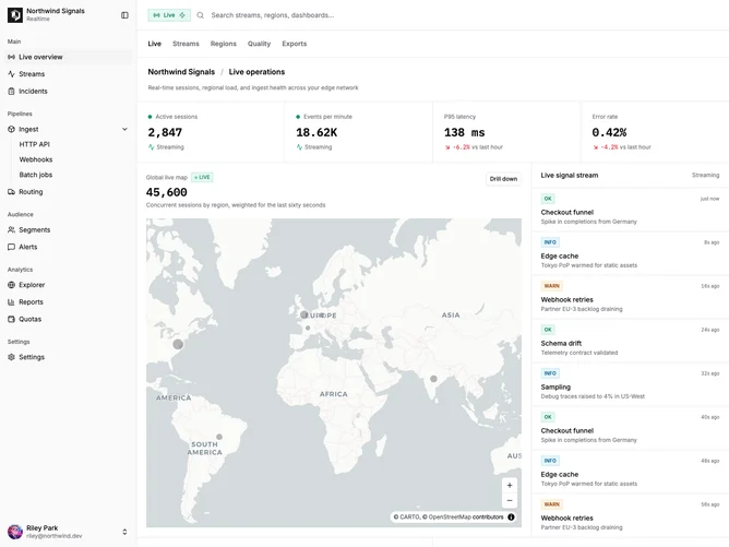
Dashboard 13 block design & features
Dashboard13 is a realtime operations dashboard built with shadcn/ui, featuring the same collapsible sidebar shell as the global analytics pattern but reorganized around a wide live map column paired with a scrolling signal stream. The header adds a live status chip beside search, and the KPI row mixes two animated counters for active sessions and events per minute with static latency and error-rate cards. The map uses mapcn MapLibre components with default Carto vector basemaps that follow light and dark theme, zoom controls, proportional session markers by country, and marker tooltips with session counts and compact M/W/O share labels. Below, both lower cards share the same row pattern: flag, dim-on-hover list rows, a three-slot metrics rail (badge when relevant, primary mono value, secondary percentage), and a thin track with a vertical reference marker (even-split line on sessions, SLO on latency). Active sessions covers ten countries; latency covers the top five markets by volume with 5m deltas—no chart library on either panel.
Surfaces stay card-based with hairline borders, monospace numerals for metrics, and emerald accents on live states including pulsing marker dots and a compact live pill on the map title row. The event stream uses small tone badges for ok, warn, and info rows with timestamps that refresh on an interval, so the panel reads as a ticker beside the map. Density is similar to other app dashboards in the set, but the middle band dedicates most width to geography rather than splitting it with a wide orders table.
This reads as an observability or product-analytics control room variant: still a shadcn-default adjacent structure, but the emphasis on streaming counters and the oversized interactive map differentiates it from standard ecommerce overview boards. Complexity is high due to the MapLibre integration and marker layer, Framer Motion on the stream row fade, and the client-side pulse hook that rewrites mock stream rows. You would replace the seeded events, per-country metrics, and coordinates with websocket or API data in a real deployment.
On small screens the layout stacks the map above the stream, then the sessions-by-country and latency-by-country cards, preserving readable touch targets and scroll areas for the feed.