Contact 3 block design & features
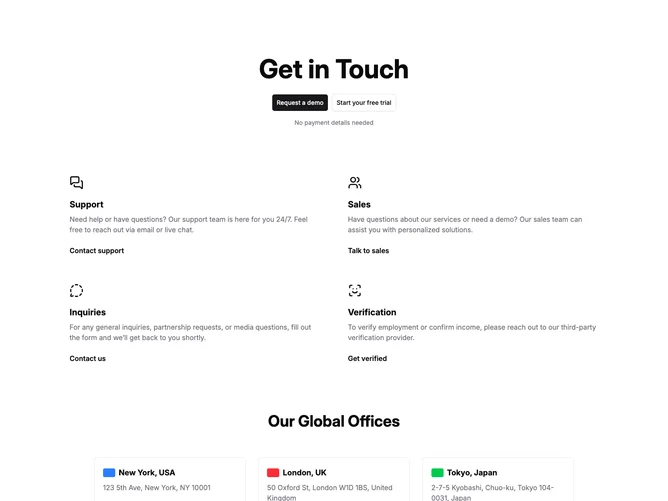
Contact3 is a long stacked contact hub built with Shadcn UI. The top band centers a dominant headline followed by two buttons (filled and outlined), then a reassurance line about frictionless signup. A middle grid places four departmental tiles across two columns, each with icon, heading, explanatory copy, and an underlined text link for support, sales, inquiries, and verification. A lower grid publishes five offices in three columns behind rounded cards accented by slim color bars that read like simplified flags.
Pale surfaces divide sections chiefly through vertical whitespace. Icons sit above departmental copy while office tiles add light radius and low shadow. Text links underline on hover. Typography carries most of the page weight with little decoration.
Straightforward institutional layout: segmented bands isolate department routing from geography. Color bars summarize regions quickly without raster flag assets. Highly content-heavy for believable placeholders across every tile and office card.
Breakpoints compress the departmental and office grids to a single-column read order without crowding headings.