
Compare 10 block design & features
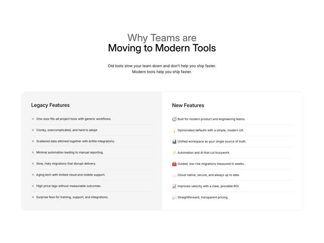
Compare10 frames a migration story using Shadcn UI, with hairline row dividers between list items. The hero copy stacks a large title where part of the phrase stays muted, a supporting sentence, and optional line break on desktop. The body is two large rounded panels: Legacy Features on a solid muted background lists eight grievance-style bullets prefixed with small X icons, while New Features sits on a bordered surface and alternates emoji bullets with short positioning lines about modern UX, unified workspaces, automation, migration safety, cloud posture, pricing clarity, and ROI.
Left and right columns share spacing rhythm and separators so scanning down each side feels parallel even though the visual tone differs (dense warnings versus brighter emoji cues).
This is a structured marketing narrative rather than a data table: strengths come from contrasting rhetorical lists, not quantitative cells. Complexity is moderate due to paired arrays and decorative rounding, but implementation stays list-driven.
On large screens the pair becomes a true split with zero gap between inner edges; on small screens the legacy block stacks above the modern block with full corner radii restored.