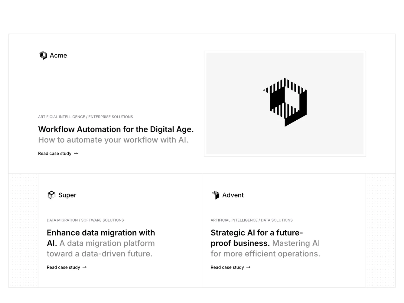
Shadcn UI Case Studies Block
The component is designed to display a curated selection of case studies, highlighting a featured one prominently. It efficiently organizes information such as logos, company names, tags, titles, and subtitles, providing a structured and visually appealing way to showcase business achievements or project summaries. This shadcn component uses well-organized blocks to separate the featured case study from other items, emphasizing priority and accessibility.
Delving deeper into its design, the component adopts a two-column layout where the featured case study occupies significant space, enticing users with a detailed view that includes an image, company logo, and a succinct description. This area leverages interactive design principles, with subtle animations like hover effects that guide users to explore further. The secondary case studies are arranged in a grid-like fashion beneath the main feature, allowing for a seamless flow of content. This shadcn block is especially suited for users who need to differentiate between primary and secondary content easily, offering a navigable experience with the potential of crafting a visual hierarchy effectively.
Dependencies
| Package | Type |
|---|---|
| lucide-react | NPM |
| react | NPM |
