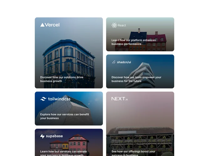
Case Studies 1 block design & features
The CaseStudies1 component is a visually appealing shadcn block designed to showcase a series of case studies, each structured to grab the viewer's attention through dynamic imagery and strategic use of overlay effects. Its layout consists of a grid system that alternates between a variety of aspect ratios, ensuring an engaging user experience by providing visual variety and emphasis on key case studies. Each case study is represented as a card that includes a compelling image background, a logo overlay, and a brief headline designed to convey the main benefit of the featured case study.
Delving deeper into its unique design elements, the component utilizes a clever combination of rounded corners, shadow effects, and transition animations to enhance the visual depth and interactivity, creating a polished feel typical of a shadcn ui element. The cards' hover effects, which scale the background images subtly, invite user interaction and focus attention on each study. This interactive responsiveness, combined with a well-planned layout that adjusts to different screen sizes, ensures that the CaseStudies1 component stands out as a sophisticated and functional choice for presenting business success stories. Moreover, the use of a light-to-dark gradient overlay ensures text and logos are prominently displayed without compromising the underlying imagery, underscoring its thoughtful design approach.