Shopping Cart 20 block design & features
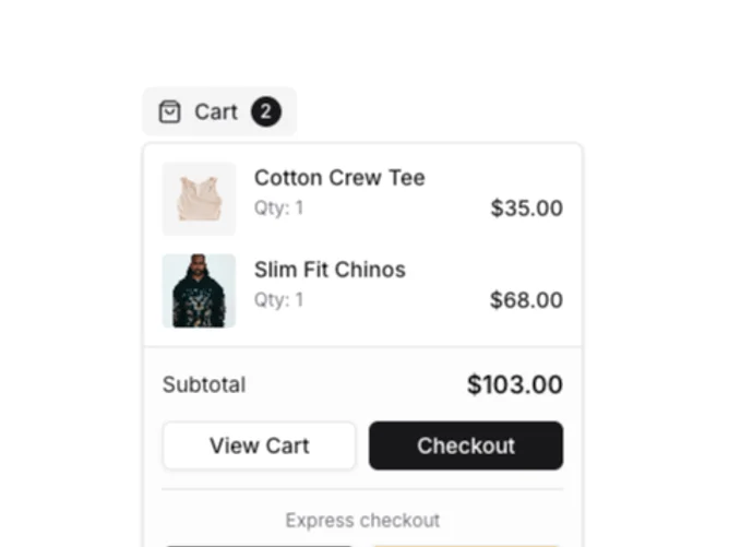
The component renders a shopping cart interface, providing users with a compact and intuitive way to manage their shopping items. It utilizes a popover design to display an itemized cart summary and facilitates various interactions, such as removing items and proceeding to checkout, all from a minimal amount of screen space. The default view includes an item count badge and a subtotal display, ensuring users are always aware of their cart's status.
Diving deeper, this shadcn component incorporates features like express checkout options, allowing for swift transactions via popular payment providers such as Apple Pay and PayPal. The integration of the shadcn UI offers a seamless user experience through dynamic interactions like hover effects for item removal, which are designed to maintain visual simplicity. The component also includes default items but is flexible enough to accept an array of items as props, enhancing its adaptability across different ecommerce applications. The use of narrow truncation for product names and the compact item layout is tailored for efficiency and user convenience, setting this apart as a unique and valuable tool for managing shopping activities.