Shopping Cart 16 block design & features
This shadcn component is a versatile and comprehensive shopping cart layout designed to streamline user interaction with e-commerce products. Through a combination of structured forms, responsive layouts, and interactive components, it effectively manages product listings and suggested additions, presenting a cohesive shopping experience. The integration of a dynamic cart system allows users to effortlessly adjust item quantities, remove items, and visualize total pricing, which is critical for an intuitive shopping journey.
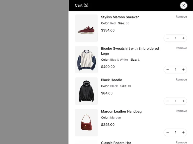
At the heart of this shadcn ui block is a robust cart system that leverages forms to manage product data dynamically. Each cart item is presented with pertinent details, such as product images, pricing (including sale prices), and configuration options like size and color. The component also enhances the shopping experience by displaying suggested products in a carousel format, directly integrating potential additions to the cart flow. The layout is adaptable, incorporating a collapsible section for suggestions, allowing users to focus on relevant content. These unique features position this component as an essential tool for creating a seamless and interactive online shopping environment.