Shopping Cart 15 block design & features
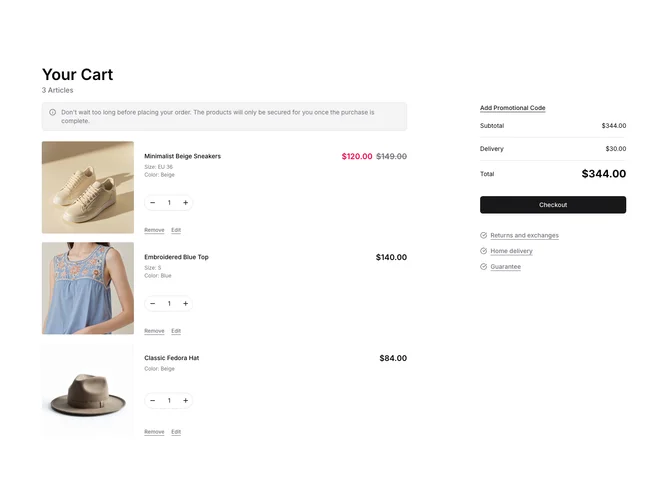
The ShoppingCart15 shadcn component enhances the user experience by offering an interactive and comprehensive shopping cart interface. It dynamically manages cart contents, seamlessly toggling between an empty cart state and a state filled with items. With intuitive navigation, users can efficiently adjust item quantities, remove products, and explore available options. This component empathizes user engagement through a visually appealing layout integrated with functional features such as promotional code application and accessible useful links, serving as a fully-crafted solution within the shadcn ui collection.
Distinctive elements make the ShoppingCart15 shadcn block notable compared to standard shopping cart interfaces. The component handles complex data inputs, like product variants, that can be toggled and updated in real-time. Its meticulous design features components like collapsible sections for promotional code entries and product editing, which provide a neat and efficient flow. Moreover, the component calculates totals adaptively, ensuring that any changes in item selections, quantities, or applied discounts reflect immediately. This shadcn block from the shadcn ui library exemplifies a comprehensive and user-centric approach, making it a powerful tool for any digital shopping experience.