Shopping Cart 14 block design & features
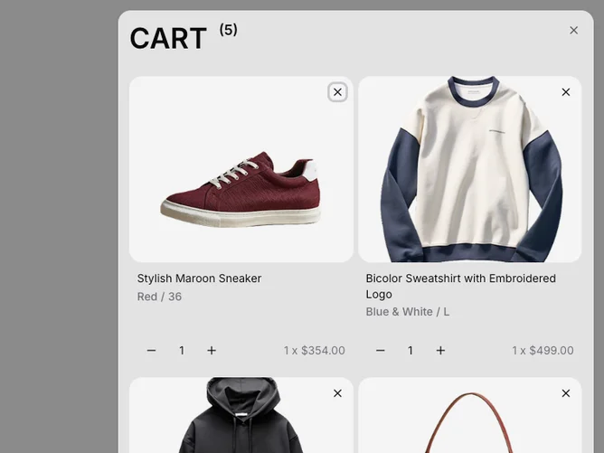
The ShoppingCart14 component is an advanced structure for displaying and managing a user's shopping cart items in a spacious and accessible format. It offers a seamless mechanism to view items grouped within a sliding panel, providing easy navigation and interaction with various cart functionalities. Items are displayed visually in an organized manner thanks to its sophisticated design, making use of a combination of a flexible panel and dynamic item components that allow quick adjustments like changing item quantities or removing items from the cart.
This component integrates multiple shadcn block elements to deliver a complete shopping cart experience. A highlight of its design is the Sheet element, a panel that delivers a smooth access point for users to view their cart items without navigating away from their main browsing page. Within this panel, the FullCart and EmptyCart conditional renders exhibit items when present or display a placeholder when the cart is empty. Additionally, each item benefits from a detailed view through the CartItem element, offering product images, detailed specs like size and color, and price management using the Price and PriceValue blocks. The inclusion of interactive elements like QuantityInput ensures a user-friendly adjustment of quantities, enhancing the conventional shopping cart feature set into a flexible, real-time updating utility.