Settings Profile 5 block design & features
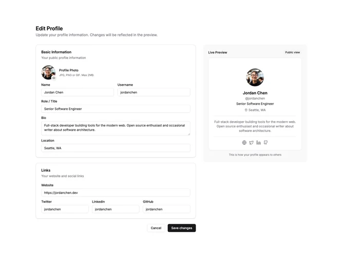
SettingsProfile5 is a two-column layout where the left side contains the edit form and the right side shows a live preview of the public profile. As users type in form fields, the preview card updates in real-time using React state.
The edit form is split into two cards: Basic Information (avatar, name, username, role, bio, location) and Links (website, Twitter, LinkedIn, GitHub). The preview card on the right is sticky so it remains visible while scrolling through the form. A "Public view" badge indicates what others will see.
The preview renders the profile as a centered card with avatar, name, username, role, location, bio, and social link icons. Empty fields show appropriate fallbacks or are hidden from the preview. Social links display as icon buttons that would link to the respective profiles.
This block is excellent for applications where users need immediate feedback on their profile changes. The side-by-side layout helps users understand exactly how their edits will appear to others before saving.