Settings Members 3 block design & features
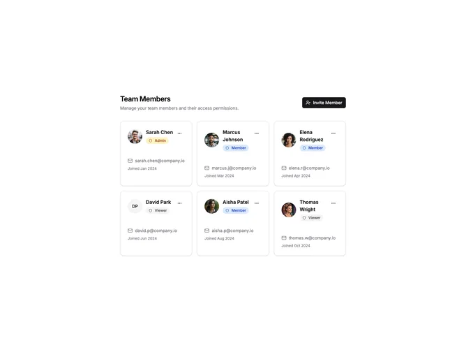
SettingsMembers3 displays team members in a responsive card grid layout. Each card shows the member's avatar, name, email, role badge, and join date with a dropdown menu for actions. The header includes an invite button that opens a dialog for adding new members.
Light background with bordered cards in a responsive grid. Role badges use color coding with red for Admin, blue for Member, and gray for Viewer. Each card has a three-dot menu with options for email, change role, and remove. The invite dialog includes email input and role selector.
This card-based layout provides a more visual, scannable display compared to tables or lists. The color-coded role badges make it easy to identify member permissions at a glance. Suitable for teams where member profiles are important.