Settings Integrations 8 block design & features
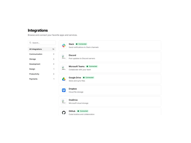
SettingsIntegrations8 is a two-column layout for browsing integrations. A narrow sidebar on the left contains a search input and a list of category filters with item counts. The main content area displays a scrollable list of integration items. On mobile, the sidebar stacks above the list.
The sidebar category buttons highlight when selected and show the count of integrations in each category. An "All integrations" option at the top shows the total count. The main list uses the shadcn ScrollArea component with a fixed height, keeping the sidebar visible while scrolling through many integrations.
Each integration row shows a bordered logo container, title with optional connected badge, description, and a chevron icon that appears on hover. Connected integrations display a green badge with a filled circle indicator. The list items link to individual integration detail pages.
This pattern suits applications with many integrations organized into distinct categories. The persistent sidebar makes it easy to filter without losing context. The scrollable main area handles long lists while keeping the page layout stable.