Settings Integrations 7 block design & features
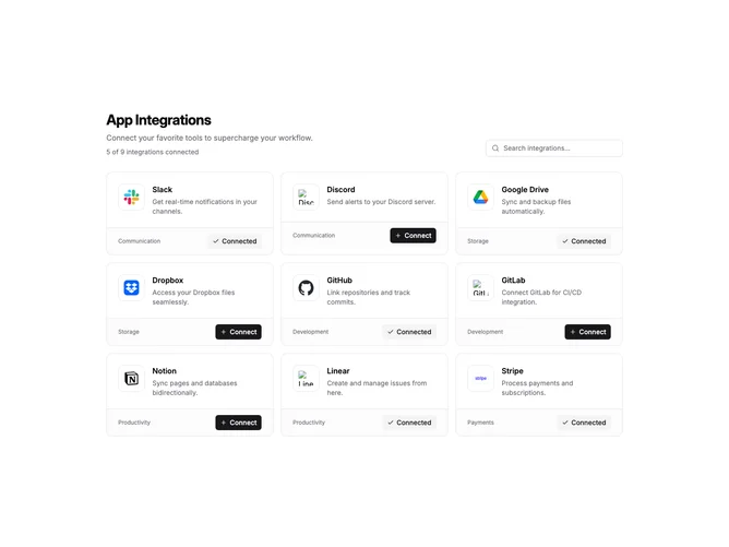
SettingsIntegrations7 is a full-page integration browser with a header section and card grid. The header includes a title, description, connection count summary, and a search input aligned to the right. Cards display in a three-column grid on desktop, two on tablet, and single column on mobile.
Each integration card has a two-part structure. The main area shows a bordered logo container, title, and description. A footer section separated by a border displays the category label on the left and a connect/disconnect button on the right. Connected integrations show a checkmark icon with "Connected" text, while available ones show a plus icon with "Connect".
The cards use subtle shadows on hover for interactivity feedback. Logo containers are square with rounded corners and a light border. The connected count in the header updates dynamically as users toggle integrations. Search filters by both title and category name.
This layout works well for browsing many integrations with clear categorization. The footer action pattern keeps the connect button consistently positioned across all cards regardless of description length.