Settings Integrations 5 block design & features
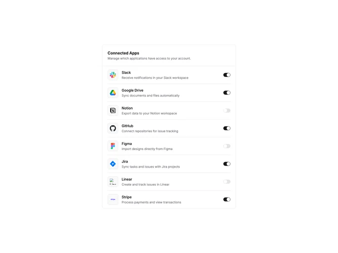
SettingsIntegrations5 is a compact settings panel for managing connected applications. The block is contained within a single bordered card. A header section displays the title and description, separated from the content by a border. Below, integrations are listed vertically with dividers between each row.
Each integration row shows a logo inside a bordered, muted background square, followed by the service name and a short description. A toggle switch sits at the far right, allowing users to quickly enable or disable the connection. The switch state is interactive and updates immediately on click.
The design is minimal and dense, suitable for settings pages where screen real estate matters. The contained card format makes it easy to place alongside other settings sections. Logo containers provide visual consistency even with varying logo sizes and colors.
This block prioritizes quick actions over detailed configuration. The toggle pattern works well for integrations that are either on or off without complex settings. For services requiring more setup, consider pairing with a detail panel or modal.