Settings Integrations 4 block design & features
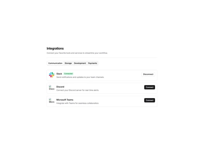
SettingsIntegrations4 is a settings page section that organizes integrations by category using tabbed navigation. The layout includes a header with title and description, followed by a horizontal tab bar. Each tab displays a vertical list of integration cards for that category. Cards show the service logo, name, description, connection status badge, and a connect or disconnect button.
The tab bar uses the shadcn Tabs component with default styling. Each integration card is a bordered container with horizontal layout. Connected integrations display a green "Connected" badge next to the title. The connect button uses the default variant while disconnect uses outline, providing clear visual distinction between states.
The visual style is functional and settings-panel appropriate. Light borders define card boundaries with comfortable spacing between items. Typography is straightforward with medium-weight titles and muted descriptions. No decorative elements beyond the standard shadcn component styling.
This is an interactive block with state management for toggling connections. Categories are derived from the integration data, making it adaptable to different service groupings. Developers would replace the default integrations with their actual supported services organized by category.