Settings Integrations 3 A block design & features
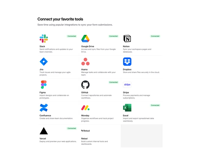
SettingsIntegrations3a is a settings page section for managing third-party integrations. The layout consists of a header with title and subtitle, followed by a responsive grid of integration cards. Each card displays a service logo, name, description, and connection status. Cards link to individual integration detail pages.
The card grid uses three columns on desktop, two on tablet, and stacks to single column on mobile. Each card has a bordered container with rounded corners and subtle hover effects including a background tint and shadow. Connected integrations show a green "Connected" badge in the top right corner. Disconnected integrations reveal an arrow icon on hover, indicating they can be clicked to connect.
The visual treatment is straightforward and functional with minimal decoration. Light borders define card boundaries, and the green badge provides clear status feedback. Typography uses a semibold title with muted description text below. The overall aesthetic is utilitarian and app-like, following common settings panel patterns.
This is a content-driven block requiring service logos and descriptions for each integration. The default data includes popular tools like Slack, GitHub, Notion, and Stripe. Developers would replace these with their actual supported integrations.