Settings Integrations 3 block design & features
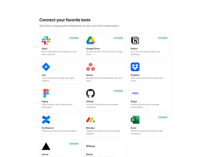
SettingsIntegrations3 displays integrations in a responsive card grid with larger visual prominence. Each card shows a large app logo, name, description, and a Connected badge if active. Unconnected cards show an arrow icon on hover to indicate they can be clicked to connect.
Light background with bordered cards that show subtle hover states with shadow and background tint. Connected badges use green styling. Large logos provide strong visual identification. The grid adapts from one to three columns based on screen width. Cards link to their respective integration pages.
This variant uses a card-based layout with larger logos for better visual scanning. The hover arrow for unconnected integrations provides clear affordance. A visually appealing approach suitable for integration marketplaces or settings pages.