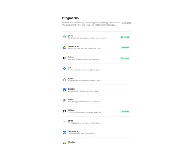
Settings Integrations 2 block design & features
SettingsIntegrations2 displays integrations in a two-column layout with the main list on the left and help CTAs on the right. Each integration row shows the app logo, name, description, and a Connected badge if active. The sidebar contains help text with links to learn more or talk to sales.
Light background with integration rows as clickable links. Connected integrations show a green badge. Unconnected integrations show an arrow icon on hover. The sidebar CTAs use a muted background with link text. Logos are displayed at a medium size with the description below the title.
This variant emphasizes the connection status and provides contextual help. The two-column layout separates the integration list from support resources. A clean, scannable design suitable for settings pages with moderate numbers of integrations.