Settings Integrations 1 block design & features
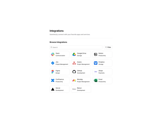
SettingsIntegrations1 displays a searchable grid of available integrations. The header includes a search input and a filter button that opens a popover with category checkboxes. Integration cards show the app logo, name, and category in a compact bordered layout. Results update based on search text and selected category filters.
Light background with a responsive grid of integration cards. Cards have rounded borders and show hover shadows. The search input has a search icon prefix. The filter popover displays checkboxes for categories like Communication, Productivity, and Storage. Selected filters show as active checkboxes.
This is a standard integration marketplace pattern for settings pages. The combination of search and category filters helps users find integrations quickly. Moderate complexity with the filtering logic and responsive grid layout.