Services 18 block design & features
The Services18 component is a Shadcn UI block designed to present an array of services in an engaging and informative manner. It showcases a collection of service offerings prominently, allowing users to quickly understand what services are available. The component features a structured layout with clear sections for service information and a call-to-action button, making it easy for users to navigate and engage with the content.
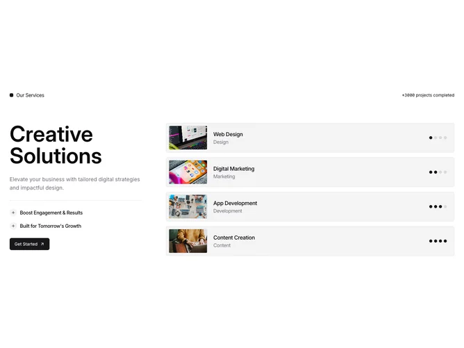
The detailed layout of the Services18 component includes a section title, a high-level summary of available services, and a grid showcasing individual service details such as the service title, category, and image. Key highlights of each service are presented with appropriate visuals, enhancing the user experience. Additionally, dynamic elements like progress indicators for each service category add an interactive touch, encouraging deeper engagement with the component's content.