Reviews 9 block design & features
The Reviews9 component provides an elegant solution for displaying user reviews in a visually engaging carousel format. By encapsulating reviews within a carousel, it allows users to browse through multiple entries seamlessly. This shadcn block offers a dynamic presentation with interactive navigation controls, making it ideal for showcasing feedback in an organized and visually appealing manner. The component is designed to present each review as a card, contributing to a clean layout that accentuates the content while maintaining aesthetic consistency across varying screen sizes.
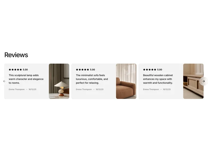
Delving deeper, the Reviews9 component showcases a thoughtfully structured carousel integrated into a single cohesive display. It utilizes a Card layout to encapsulate individual reviews, combining textual feedback with visual elements for a comprehensive presentation. The component features a sophisticated navigation system with previous and next controls, ensuring intuitive interaction. Its unique design includes user ratings, comments, and author information, all of which are complemented by visually appealing product images. The use of these shadcn ui components enhances the interface’s usability and aesthetic appeal, setting it apart as a refined solution for highlighting user feedback effectively.