Reviews 6 block design & features
The Reviews6 component is a dynamic and visually appealing block showcasing customer testimonials paired with the products being reviewed. This shadcn ui enhances user engagement by presenting reviews and product details interactively through a carousel interface, which facilitates seamless navigation between different customer experiences.
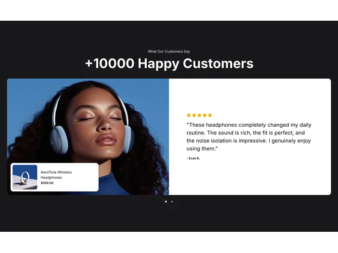
In-depth, the Reviews6 shadcn component is structured to highlight customer feedback alongside associated product information. Utilizing carousel functionality, it allows for a fluid browsing experience where users can peruse reviews with integrated directional controls for smooth navigation. Each review card prominently features an image of the reviewer, their rating, and a brief comment, accompanied by product details such as the product image, name, and price. This tandem presentation ensures that users gain comprehensive insights into the product performance through real customer experiences, all within an elegantly organized and cohesive layout. The emphasis on showcasing both the reviews and corresponding products within this shadcn block offers users an enriched and informative interface, setting it apart from more simplistic review displays.