Reviews 3 block design & features
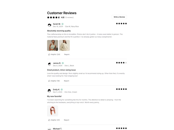
The Reviews3 component provides a structured and interactive display of customer reviews, focusing on delivering detailed user feedback. It aggregates reviews to calculate and display an average rating, offering a comprehensive view of user sentiment. This functionality is supported by a visually engaging layout that features individual review cards, highlighting user-generated content through well-placed avatars and a clear display of verification status. As a shadcn block, it seamlessly integrates and enhances user interaction by allowing users to mark reviews as helpful and even contribute their own.
This shadcn component is distinct for its attention to detail, not only in the information it presents but in its user interface features. The component includes features like displaying a list of reviews with a clearly defined structure, showing detailed ratings, and handling user interactions such as marking reviews as "Helpful." The integration of rich media with the AspectRatio block allows for attractive image views, making the component stand out in presenting visual content effectively. It utilizes a robust design following a consistent layout, maintaining a cohesive look with suitable separators and spacing, ensuring that the user can focus on each review individually without distraction.