Reviews 2 block design & features
The Reviews2 component serves as an engaging and comprehensive section for displaying customer reviews. It integrates a visually appealing layout that blends numeric ratings, textual feedback, and user details into a cohesive presentation. By incorporating elements such as avatars, ratings, and textual descriptions, it provides a rich user interface for showcasing feedback, making it both informative and visually satisfying. The component distinguishes itself with a clean and structured design, maintaining a focus on user perception through varied visual elements.
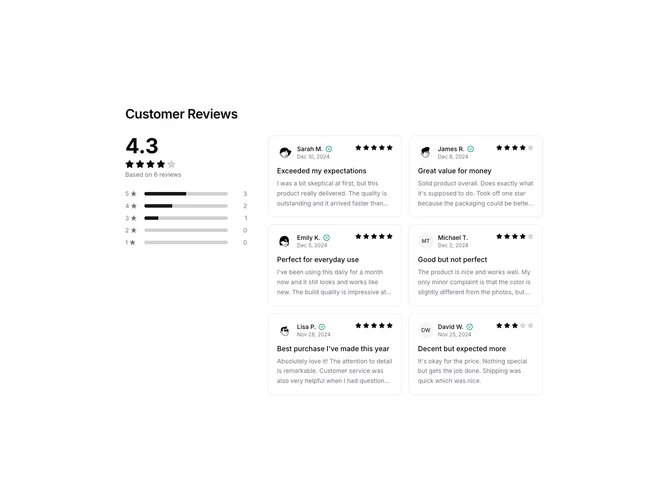
In more detail, the Reviews2 component harmonizes various sub-components into a functional review platform. On the layout side, it efficiently utilizes a grid system to separate a sidebar summary from an individualized reviews section. The sidebar conveniently highlights the overall average rating and a breakdown of rating distributions via progress bars, crafted to deliver an at-a-glance impression of user satisfaction. Each individual review is encapsulated in a card-like structure, offering a neat and organized view that includes the author’s avatar, their name, review title, personal experience, and a timestamp. Notably, verified reviewers are marked with an exclusive badge, enhancing the authenticity of the review display. This component shines in its ability to aggregate and convey user feedback dynamically, embodying a carefully considered design synonymous with the shadcn ui style.