Reviews 18 block design & features
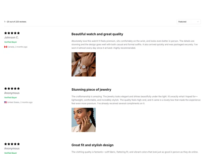
The Reviews18 shadcn block provides a comprehensive solution for displaying user reviews with detailed ratings and image galleries, aimed at enhancing user engagement through visual storytelling. At its core, this component is designed to collect and present customer feedback in an attractive and organized manner, leveraging a blend of textual and visual elements to create a rich user experience. By integrating rating systems, author verification indicators, and the capability to display images alongside reviews, the component supports an interactive and informative showcase of customer testimonials.
In more detail, the Reviews18 shadcn component employs a multi-faceted layout to differentiate itself from standard review displays. It allows users to filter and paginate through reviews effortlessly, thanks to its built-in sorting feature. Each review is wrapped in a two-column grid, where textual content is paired with a dynamic image carousel. This carousel is enhanced by a PhotoSwipe lightbox effect, offering a full-screen viewing experience of product images, augmented with intuitive navigation controls and custom indicators. By combining these graphical elements with the precision of shadcn UI components like badges and buttons, the component not only organizes reviews but also enriches them with a sophisticated and modern aesthetic.