Projects 6 block design & features
The Projects6 component serves as a visually engaging project showcase, highlighting key projects with striking images and captivating descriptions. Each project is presented as a distinct card that utilizes animation and visual effects to attract attention and encourage interaction. The component effectively arranges different projects in a responsive grid layout, allowing easy navigation and exploration of varied content.
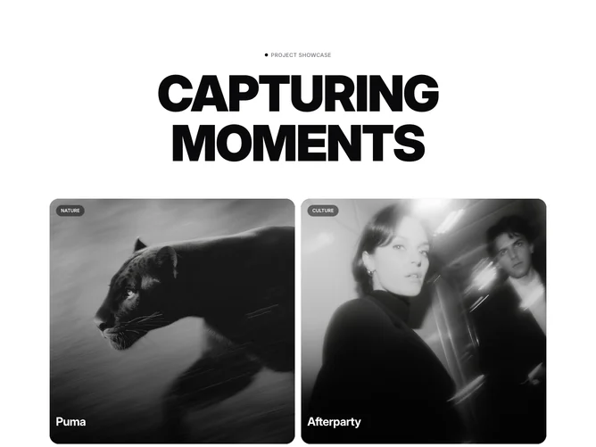
Designed with both aesthetic appeal and functionality in mind, the Projects6 component makes use of the shadcn ui to ensure vibrant and dynamic presentation. Each project card employs subtle animations triggered on hover to enhance user interaction, along with detailed visual elements like gradients, shadows, and transitions to provide depth and focus. The component also categorizes projects by topic, such as Nature or Culture, using visually distinct tags and accompanying descriptions to improve content discoverability and interest.