Projects 15 A block design & features
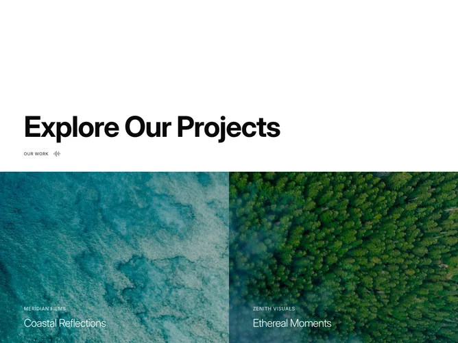
The component is a visual display section that presents a collection of videos in an interactive manner, primarily aimed at showcasing various projects. Each video is initially previewed with a static thumbnail image, which transitions into a video playback upon hovering. This design effectively combines visual engagement with informative content, offering a layered presentation.
Delving deeper into its design, the component leverages hover effects to toggle between a thumbnail and a video, enriching the user experience with dynamic content display. The thumbnail serves as an initial view, maintaining performance by loading videos on demand. Text overlays provide context by displaying the studio name and project title, enhancing the component's utility for visual storytelling within a project showcase or portfolio.