Projects 1 block design & features
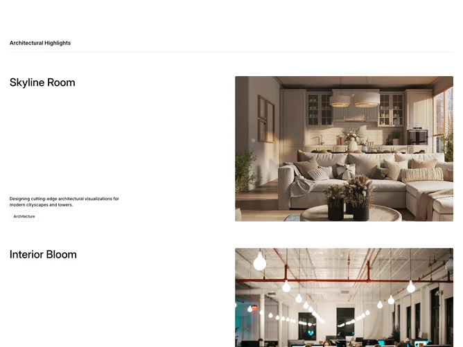
The Projects1 component presents a visually engaging showcase of architectural and design-related projects. It uses a grid layout to feature multiple projects, each accompanied by an image, description, and category tag. As users scroll through the page, the component leverages subtle animations to bring each project into view dynamically, enhancing user engagement and maintaining visual interest.
This shadcn component is structured to highlight specific projects through a two-column layout, with project details and images aligned adjacently. It employs animations for elements appearing on the screen, ensuring a smooth visual transition as users browse different projects. Each project card focuses on a concise yet informative representation, with the inclusion of a badge indicating the project's category, making it easy for users to quickly ascertain the type of project they are viewing.