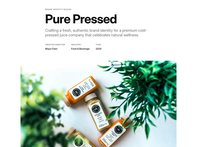
Project 4 block design & features
The block uses a narrow max-width container for text content and a wider container for the hero image, creating a breakout effect. The header presents a small uppercase label, a large bold title, a subtitle paragraph, and a row of three metadata items (creative director, industry, year). A full-width hero image follows. The body is rendered with prose typography and organized into titled sections covering the challenge, process methodology, and outcome, interspersed with breakout images that extend beyond the text column using negative horizontal margins. Image captions are centered and italicized.
The prose styling applies default heading and paragraph spacing, with ordered lists used for the design methodology steps. Breakout images span wider than the text column, creating rhythm between narrow reading passages and wide visual breaks. Headings use semantic sizes (h2, h3) within the prose container.
The aesthetic is article-like, following a traditional long-form case study format. No animations or interactive elements are present, keeping the reading experience straightforward and focused. Built with Shadcn UI prose and spacing conventions.
The breakout images reduce their negative margins on smaller screens, and the metadata row wraps when space is limited.