Product Specs 2 block design & features
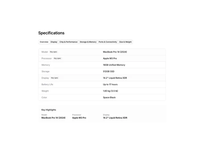
The ProductSpecs2 component is designed to elegantly showcase detailed specifications for a product in a tabbed format. This shadcn component allows users to easily switch between different categories like "Overview," "Display," "Performance," and others, each containing a list of specs relevant to the category. Its design is structured to enhance readability and user engagement by presenting key specifications prominently, allowing users to quickly grasp the most important information.
The component uses a combination of tabs and collapsible sections to organize information efficiently. This shadcn ui is particularly useful for highlighting key features via a "Key Highlights" section at the bottom, ensuring that standout aspects of the product are not missed. It leverages a grid-based layout to display each spec label alongside its value, using icons to denote boolean values, adding an interactive visual cue. The option to customize the component with different specification groups and CSS classes allows it to be tailored for various contexts, setting it apart from more static component designs.