Shadcn UI Product Gallery Block
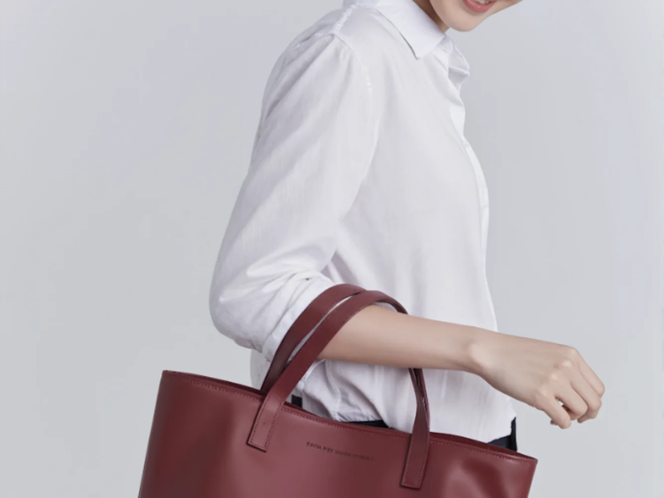
ProductGallery2 is a sophisticated image carousel component designed for displaying product images in a visually appealing and interactive way. Utilizing a collection of images, the component presents them in a seamless carousel format, allowing users to navigate through the images with ease. By integrating a lightbox feature, it enhances the viewing experience by enabling zoom functionality and offering intuitive navigation controls. The distinct inclusion of shadcn UI components amplifies the interface with elements like badges and navigational buttons, providing a cohesive and polished user experience.
Delving further into its structure, ProductGallery2 stands out with its integrated lightbox capabilities using PhotoSwipeLightbox that enrich the interactive experience. Uniquely, it registers custom UI elements such as next and previous buttons, a custom close button, and an image indicator within the lightbox environment. This customizability is powered by a shadcn component design ethos, focusing on a clean and efficient interface. The buttons and badges—crafted with shadcn block styling—are strategically positioned for intuitive access, ensuring the gallery feels dynamic yet organized. Additionally, the component employs a responsive design by utilizing shadcn’s aspect-ratio utility, maintaining consistent image presentation across different screen sizes.
Dependencies
| Package | Type |
|---|---|
| lucide-react | NPM |
| photoswipe | NPM |
| react | NPM |
aspect-ratio @shadcn | Registry |
badge @shadcn | Registry |
button @shadcn | Registry |
carousel @shadcn | Registry |
