Product Detail 9 block design & features
ProductDetail9 is a shadcn ui component designed to showcase detailed information about a specific product in a visually engaging layout. The component seamlessly integrates an array of product images along with essential product information, including pricing and description. This shadcn block is ideal for displaying products that have multiple visual aspects to highlight, offering potential buyers a comprehensive view of what they are considering.
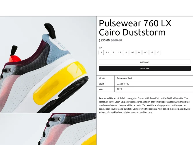
At its core, ProductDetail9 integrates a carousel for managing product images alongside an interactive form for selecting product variations such as size. Unique features include its use of a lightbox for viewing images in an enhanced format, enabling Zoom and scroll features for each image. The component also incorporates dynamically styled pricing where a product can have both regular and sale prices, distinctly formatted for easy differentiation. Buyers can effortlessly select product options using the integrated radio group, which leads to an interactive form submission process suited for e-commerce or similar applications.