Product Detail 8 block design & features
This shadcn ui component, ProductDetail8, offers a comprehensive display module tailored for showcasing product information, particularly for retail contexts. This shadcn component effectively integrates various interactive elements such as image galleries and detailed product forms, allowing users to seamlessly explore product details before making a purchase decision. By combining user-centric elements like a carousel for images and options for selecting product variants such as size and color, this component enhances user engagement and supports informed decision-making.
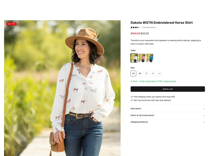
The ProductDetail8 block is designed to display a product's appeal and essential information with a sophisticated layout. It features a visually appealing image carousel powered by PhotoSwipeLightbox, aiding users in viewing product images in detail. This functionality is combined with a comprehensive form to choose product options like color and size, utilizing radio groups enhanced by clear stock status indicators. The component also includes an accordion section for additional product information such as descriptions, care instructions, and shipping details. This integration of features, such as configurable forms and a dynamic gallery, sets this component apart, making it distinct from standard product display modules by prioritizing both aesthetics and functionality in presenting detailed product attributes efficiently.