Product Detail 7 block design & features
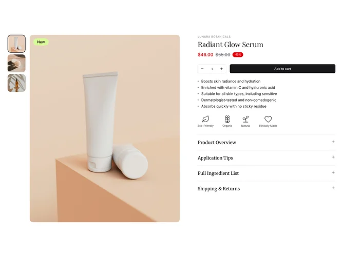
ProductDetail7 is a versatile component designed to present detailed product information with an emphasis on interactivity and clarity. This shadcn ui component combines image galleries, comprehensive product specifications, and interactive forms, enhancing the overall shopping experience. By seamlessly integrating imagery, price details, product features, sustainability icons, and detailed descriptions, it provides a rich and informative interface that allows users to explore various aspects of a product effectively.
The component shines with its robust design, tailored for displaying product images through a carousel and thumbnail navigation paired with PhotoSwipe for an immersive viewing experience. The strategic use of shadcn block functionalities enables dynamic content rendering, such as varying price tags, product feature listings, and accordion sections for expandable product information. Its clever layout ensures users receive pertinent product details, including pricing, features, and sustainability marks in a coherent structure, elevating the e-commerce interaction beyond conventional templates. The component's focus on clarity, coupled with functional interactivity like form handling for quantity selection, makes it uniquely effective in providing an engaging and informative user experience.