Product Detail 6 block design & features
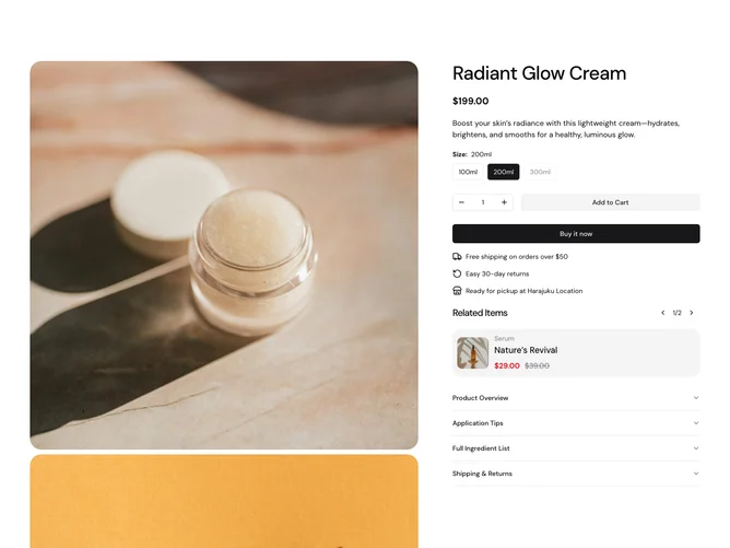
The ProductDetail6 shadcn ui component presents an in-depth layout for displaying detailed information about a product. It is designed to offer users a comprehensive view of a product, including images, pricing details, and purchasing options. This shadcn component focuses on both presentation and interactivity, providing a seamless experience for users to explore and make informed buying decisions. Notably, it includes unique features such as a dynamic image carousel with a zoom feature, ensuring that users can view product images in detail.
What sets this shadcn block apart is its modular design featuring a combination of user interface elements like accordions for detailed product descriptions and application tips, a radio group for selecting product sizes, and a dynamic cart functionality for adding products directly from the page. It integrates accessibility and ease of interaction, with features such as sticky elements that guide the user through purchasing steps. The use of a comprehensive form-handling mechanism powered by a schema ensures robust validation and customization of the product options. Additionally, the component has a section for showcasing recommended products, allowing users to easily navigate through related items. Overall, this component uniquely combines aesthetic design and functional capability, making it a vital part of any sophisticated ecommerce platform.