Product Detail 4 block design & features
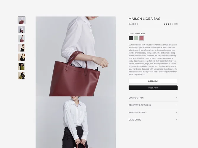
This shadcn block presents a sophisticated product detail layout, emphasizing both visual appeal and functional clarity. At its core, the component showcases a high-end handbag, enabling potential customers to explore product images in a captivating carousel format. Through this interactive gallery, enhanced by integration with a lightbox library, users can zoom in for a closer examination, making the shopping experience more engaging. The layout is organized into a two-column design, with imagery on one side and detailed product information on the other, ensuring users can easily navigate between visual and textual content.
Diving deeper into the component's utility, the shadcn ui provides an enriched product exploration experience with its thoughtful features. A standout aspect is the inclusion of hinge options for different color selections, displayed as a color swatch radio group. The user can understand this visual representation to decide on color, instantly updating the product information section to reflect the color's availability and current selection. The embedded accordion feature organizes essential product descriptions, delivery details, and care instructions, making the component not just about aesthetics but also about delivering comprehensive product insights. This ensures the component serves as a unique bridge between aesthetic presentation and informative guidance, setting it apart from more straightforward product display interfaces.