Product Detail 3 block design & features
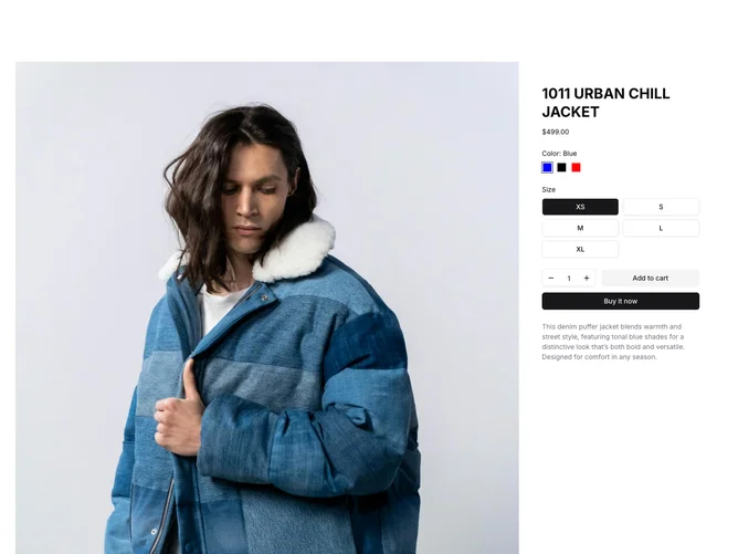
The component displays detailed information about a product, featuring options for customization and a gallery of images with interactive features. It combines a grid layout to present product images alongside a detailed product form, allowing users to customize the item by selecting attributes such as color, size, and quantity. With its visual clarity and interactivity, this component enhances the user experience around product exploration and customization.
Through its integration of a shadcn ui shadcn block carousel and a photo lightbox, this component features a dynamic image gallery that provides a seamless experience for viewing product images in detail. The embedded form leverages a structured schema to validate and manage user input, offering choices through radio buttons and quantity selectors. The inclusion of custom navigation elements within the lightbox, alongside the distinctive styling of the radio selector buttons, makes it a standout choice for presenting customizable product details effectively.