Product Detail 2 block design & features
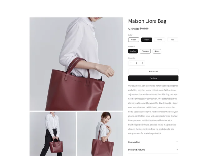
The ProductDetail2 component provides a comprehensive showcase of a product's essential details, prioritizing user interaction through engaging features. This shadcn component elegantly arranges product information, images, and selection options, allowing users to thoroughly explore and customize their purchase choices. It offers a streamlined interface for viewing product images, selecting different product attributes such as color and material, and adjusting quantities, all within a well-structured layout.
Diving deeper, the component stands out with its sophisticated design choices and functionality. Utilizing a carousel for image display, users can seamlessly navigate between high-quality product images enriched with zoom capabilities through PhotoSwipeLightbox integration. For user convenience, customization options are presented in a logically grouped manner using a flexible form mechanism powered by a custom hook, enabling dynamic enhancements such as stock status visibility and interactive radio groups for different product attributes. Moreover, the component implements a responsive design maintaining a consistent user experience across devices while embodying the modern aesthetics of a shadcn ui, enhancing engagement and interaction between the users and these visual elements.