Product Detail 10 block design & features
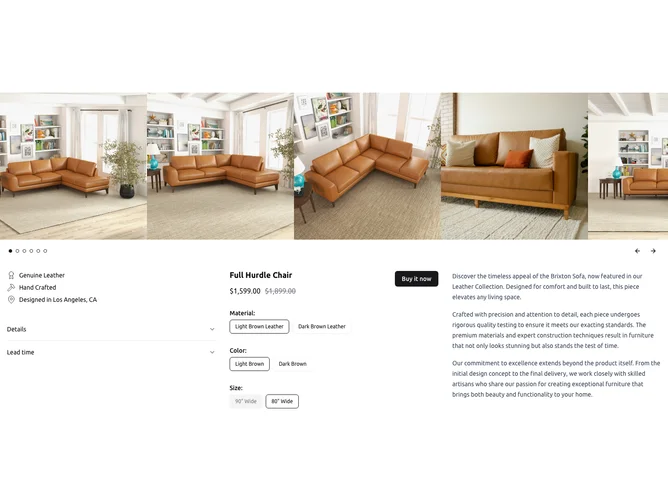
ProductDetail10 is a versatile shadcn ui component designed to display detailed product information, exemplifying the unique qualities that shadcn components can offer. It provides a comprehensive layout, including a carousel for product images, a form for selecting product options, and an accordion for supplementary product information. The component effectively captures the essence of a product, integrating cohesive elements that allow users to explore various facets, such as material, color, and size, in an intuitively interactive manner. Its smooth integration of visual and interactive components enhances user engagement, making it a valuable tool for presenting product details compellingly.
This shadcn block showcases a meticulous design with a three-column layout, where each column performs a specific function: displaying product traits, presenting the purchasing interface, and providing an in-depth product description. The component features a well-crafted carousel that captures users' attention with responsive image handling and easy navigation options. Additionally, the product form empowers users to choose from available configurations, giving clear visual feedback on the availability of options through the use of shadcn components like radio groups. The accordion feature not only adds a layer of dynamic interaction but also organizes information in a digestible and concise manner. Together, these features differentiate ProductDetail10 from generic product display components by offering a seamless blend of functionality and aesthetics, elevating the overall user experience.