Product Categories 5 block design & features
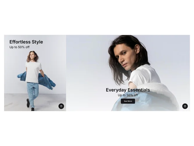
ProductCategories5 is a versatile shadcn component designed to display product categories with visually engaging media elements. This component supports both video and image media types, making it an excellent choice for showcasing diverse product lines or promotional content in an appealing format. By integrating a prominent call-to-action button associated with each category, it encourages user interaction and facilitates seamless navigation to related content or product pages.
In-depth, the design of ProductCategories5 is crafted with a dynamic grid layout that adapts to various screen sizes. The component features two main sections, each highlighting a distinct product category with relevant media, title, and promotional text. The first section is dedicated to a video element that plays in a loop, adding a lively touch, while the second section supports a responsive image setup. A unique feature of this shadcn block is its elegant overlay gradient, enhancing text legibility and drawing attention to the promotional messages in a subtle yet effective manner. The inclusion of a customizable className prop further extends the flexibility, allowing the component to be easily styled and integrated into a variety of design systems.