Product Categories 4 block design & features
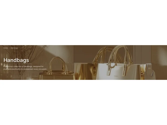
The ProductCategories4 component offers a visually appealing and functional section for displaying product categories, such as handbags, within a webpage. It notably integrates breadcrumb navigation—a shadcn block that informs users of their navigation path within the site. This feature proves key for enhancing user experience, by not only aiding navigation but also providing context. The component excels in showcasing product-specific content, leveraging a vivid background image that aligns with the product theme to draw user attention effectively.
Delving deeper, ProductCategories4 is uniquely crafted to combine product information display with seamless navigation via its breadcrumb component. The design utilizes a full-bleed background image setting that sets the stage for the content housed within it, offering a luxurious look and feel that aligns with its projected category—handbags in this case. Additionally, it caters for customizability by accepting various props such as breadcrumb, title, and description, allowing it to adapt to various product themes or marketing needs effortlessly. These features underscore its utility as a shadcn ui component, differentiating it from simpler alternatives that might lack advanced navigation or dynamic styling capabilities.