Product Categories 3 block design & features
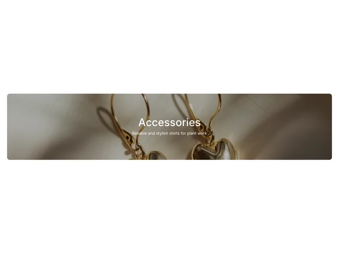
The ProductCategories3 shadcn component is designed to display featured product categories with an attractive and engaging layout. It can seamlessly showcase a product image alongside a title and summary, capturing the users' attention with an elegant overlay and visually striking text presentation. Ideal for any context where highlighting specific product categories is necessary, this block efficiently combines functionality with aesthetics.
This shadcn ui component is characterized by its structured layout, where a product image is given prominence through a zoom-in animation, creating a dynamic visual effect. The text content, consisting of a customizable title and summary, is displayed centrally on the image with a subtle, semi-transparent overlay that ensures readability while maintaining the visual impact of the underlying image. This shadcn block's flexibility is further enhanced with optional class customization, allowing for easy adaptation to different style requirements or branding guidelines. These unique features differentiate it from more generic product category displays, offering both sophistication and utility for effective product promotion.