Product Categories 2 block design & features
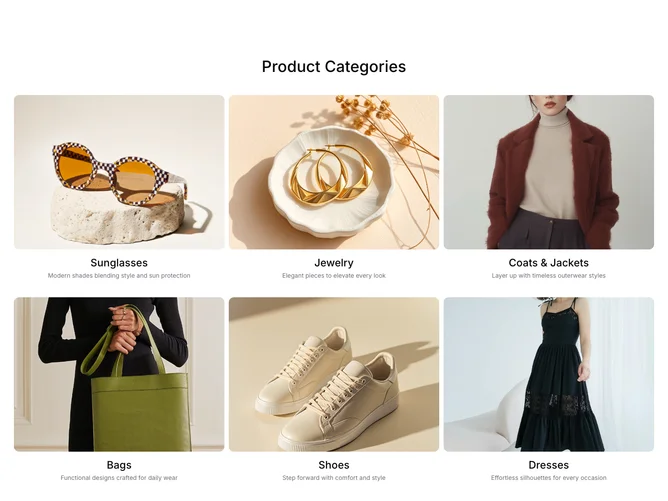
The ProductCategories2 component is designed to showcase a diverse collection of product categories in an engaging format. Utilizing a modular design, it allows for the display of title, image, and summary information for each category. This layout is ideal for online storefronts looking to visually entice customers to explore products in specific categories. Each category is presented with an eye-catching visual, title, and description, creating an intuitive navigation experience for users.
In more detail, the component leverages a sophisticated grid layout to arrange product categories in a structured format that enhances visual storytelling. Featuring animations that draw user attention to each category, the component smoothly fades in and presents each product with a delay based on its position, adding a dynamic and polished interface. The embedded AspectRatio ensures that images maintain consistent dimensions across various devices, and the Card elements further enhance presentation by organizing product information clearly. Small interactive elements, such as image scaling on hover, give users a sense of interactivity. The ProductCategories2 component stands out for its blend of visual appeal and functionality, solidifying its utility within a larger shadcn component library.