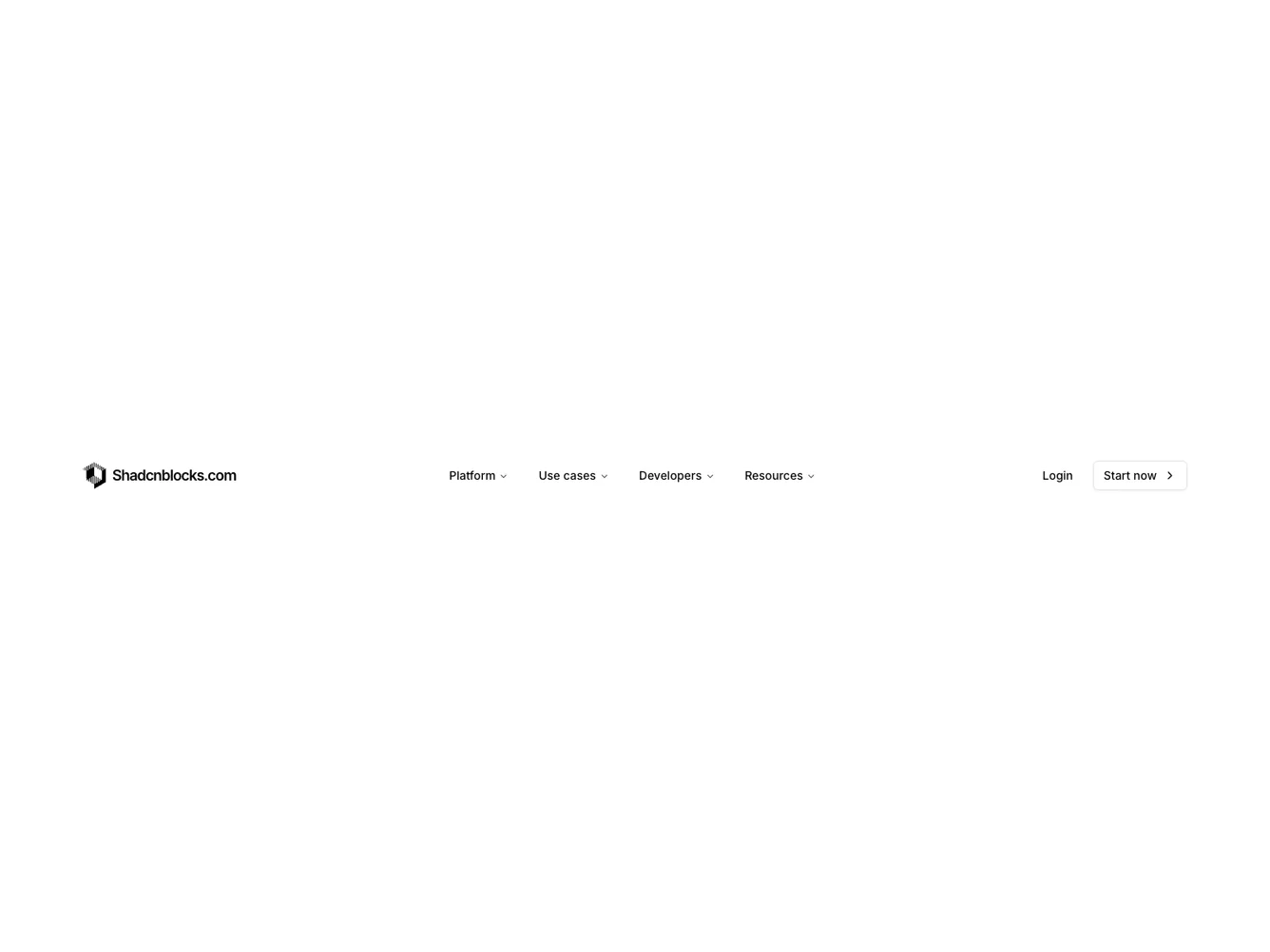
Shadcn UI Navbar Block
The Navbar3 component is an intricately designed navigation bar tailored to showcase a variety of platforms, use cases, developer resources, and other useful links. Integrated with shadcn component elements, this interactive navigation structure provides an engaging user experience, featuring multiple navigation tiers and dynamic content display. Such a component plays a vital role in enhancing user navigation through a website's ecosystem by providing clear pathways to different sections, ensuring users can access the information they need quickly and efficiently.
Delving deeper, the Navbar3 component features a sophisticated, multi-layered navigation structure incorporating shadcn ui elements for an enriched user interface. The navigation menu is segmented into distinct categories such as Platform, Use cases, Developers, and Resources, each revealing pertinent and detailed content upon selection. Icons, imagery, and text descriptions contribute to both the aesthetic and functional utility of this component. Additionally, the Navbar3 design offers adaptive elements like collapsible menus and transition animations to ensure it performs effectively on both desktop and mobile platforms.
Dependencies
| Package | Type |
|---|---|
| lucide-react | NPM |
| react | NPM |
logo @shadcnblocks | Registry |
badge @shadcn | Registry |
button @shadcn | Registry |
navigation-menu @shadcn | Registry |
