Logos2

Pro

Component Data

  • ID:logos2
  • Access:pro
  • Created:Aug 5, 2024
  • Type:block
  • Release:Sep 2024

Logos2 - Shadcn Logos Block

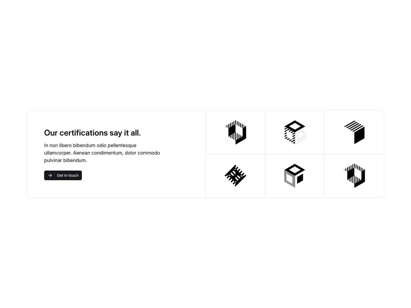
The Logos2 component presents a visually appealing way to showcase a collection of logos alongside a call-to-action message. The design is structured into two main sections: an informative text block and a grid layout displaying logos. This configuration highlights key certifications or partnerships by displaying logos in a structured grid next to a compelling message and a button for user interaction. The component is part of the shadcn ui collection and exemplifies the flexibility and design patterns within shadcn blocks.

The left portion of the component prominently features a headline and a brief description, designed to capture the user’s attention and convey the significance of the displayed logos. The right side consists of a uniformly styled grid layout, each cell harboring an image representing a logo. This design not only provides a balanced visual experience but also emphasizes the diversity and credibility of the featured brands. By utilizing grid systems and logical spacing, this shadcn component offers an intuitive way to consolidate and display brand identity elements seamlessly within a webpage.
Features

  • Dynamic Logo Grid: Displays a structured grid of logos, emphasizing versatility in showcasing multiple brand elements.
  • Call-to-Action Integration: Includes an interactive button encouraging user engagement and connection.
  • Responsive Grid Layout: Utilizes a consistent grid design, ensuring aesthetic harmony across logos within shadcn blocks.
  • Balanced Text & Visual Sectioning: Harmoniously pairs textual information with visual elements to maintain user focus and clarity.
  • Highlight Section for Trust Building: Features a highlight section to emphasize the reliability or certifications backed by the logos displayed.

Use Cases

  • Corporate Partnership Display: Ideal for highlighting partnerships with key industry players or clients using the logo grid.
  • Certification Promotion: Use the component to underline certifications visually, aiding in establishing brand trust.
  • Brand Identity Page: Suitable for sections within a brand identity page where company affiliations and accreditations are showcased.

Dependencies

PackageType
lucide-reactNPM
button
@shadcn
Registry