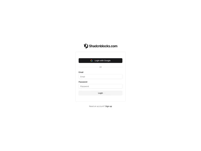
Login6

Pro

Component Data

  • ID:login6
  • Access:pro
  • Created:Apr 23, 2025
  • Type:block
  • Release:Dec 2024

Login6 - Shadcn Login Block

The Login6 component is a compact, card-style authentication UI designed to facilitate user sign-in with simplicity and style. It provides users with options for signing in through Google as well as traditional email and password fields, all within a sleek design. The integration of a logo and customizable text fields makes it a flexible piece for a brand-aligned user login experience.

Built as a shadcn block, this component exceeds typical login forms by incorporating key visual elements and interaction features. By utilizing shadcn UI principles, it offers a harmonious balance between visual appeal and practical functionality. The component includes a distinctive separation line with a muted style choice, elevating its design. The inclusion of a sign-up prompt below the form encourages user registration and expands its utility beyond mere login functionality.

Features

  • Dual Authentication Options: Provides both Google and email/password sign-in methods for user flexibility.
  • Brand Alignment: Features customizable logo display to ensure consistent brand presentation.
  • Visual Separation: Incorporates a clear visual divider to distinguish between different login methods.
  • Interactive Prompt: Includes a subtle call-to-action for new users to sign up, increasing user engagement.
  • shadcn Dependency: Utilizes a shadcn block structure for component stylization and seamless UI integration.

Use Cases

  • User Portal Access: Facilitates access to user-specific areas or dashboards with ease.
  • Brand-Centric Login: Ideal for web applications requiring brand-specific login interfaces.
  • UX-Enhanced Login: Suitable for applications seeking to improve user experience through modern design cues.

Dependencies

PackageType
button
@shadcn
Registry
input
@shadcn
Registry
label
@shadcn
Registry